Project:
Amaray—Branding
formerly unnamed Greystar property
*HOW International Design Award Winner
Amaray—Branding
formerly unnamed Greystar property
*HOW International Design Award Winner
Roles:
identity designer, writer, naming support
print & web design lead
identity designer, writer, naming support
print & web design lead
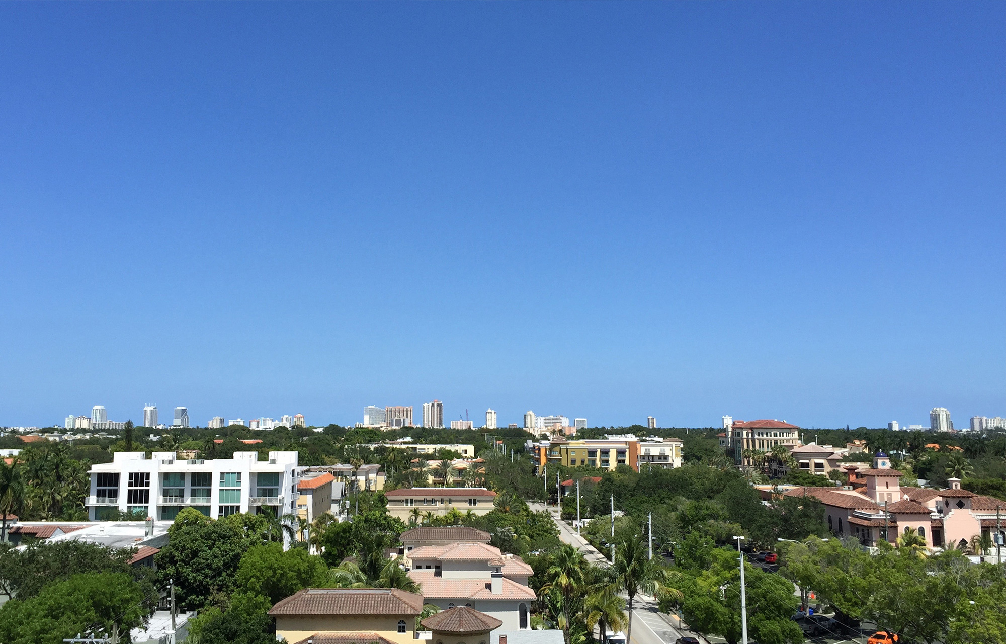
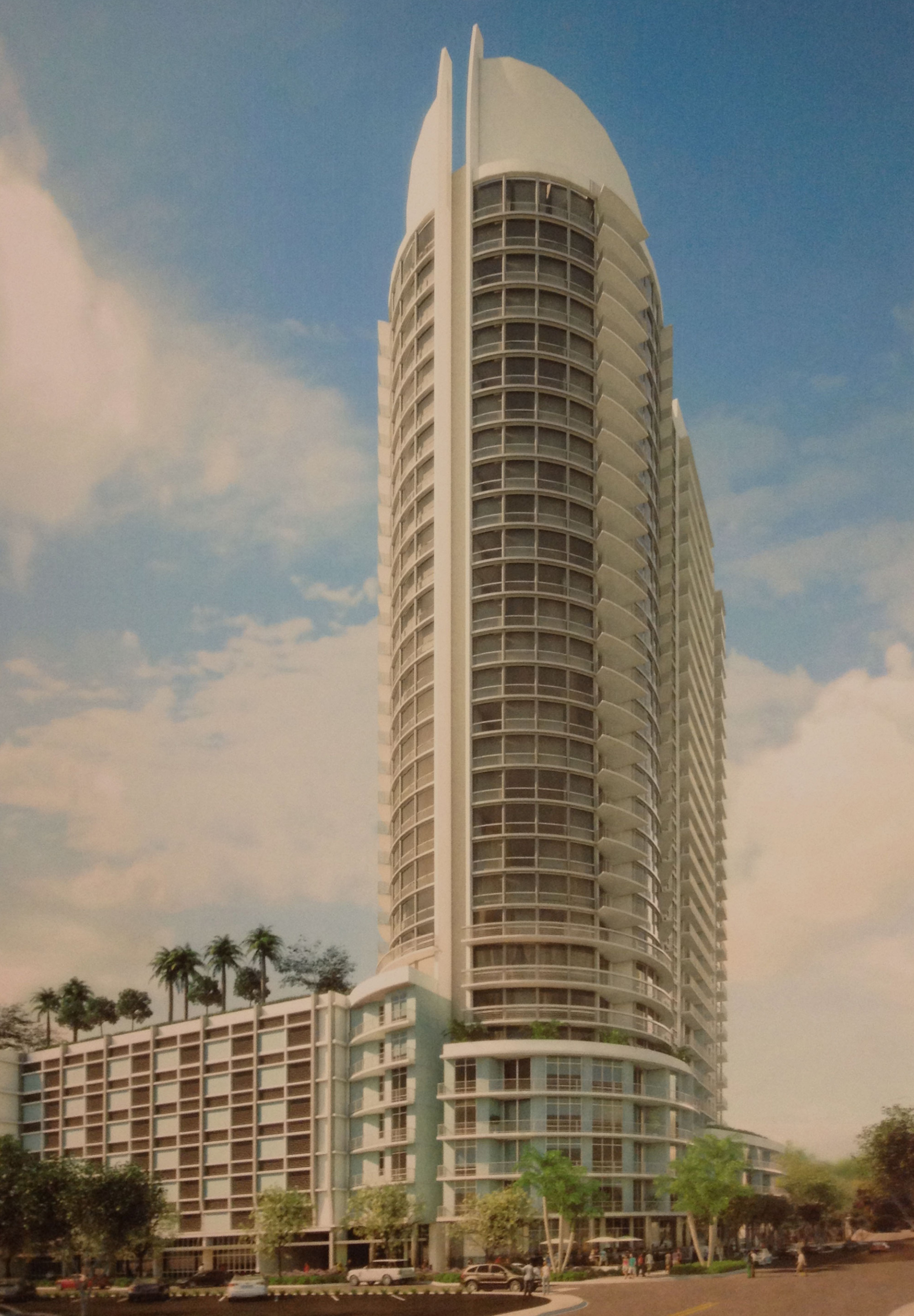
A team of national property managers came to us looking for help to brand their newest apartment community in sunny Fort Lauderdale, Florida. Where “high-rise luxury” is as common a phrase as “watch the sunset from your balcony,” we needed to think outside
the apartment brand box to create a sense of place that feels like a natural piece of the cultural and physical landscape.
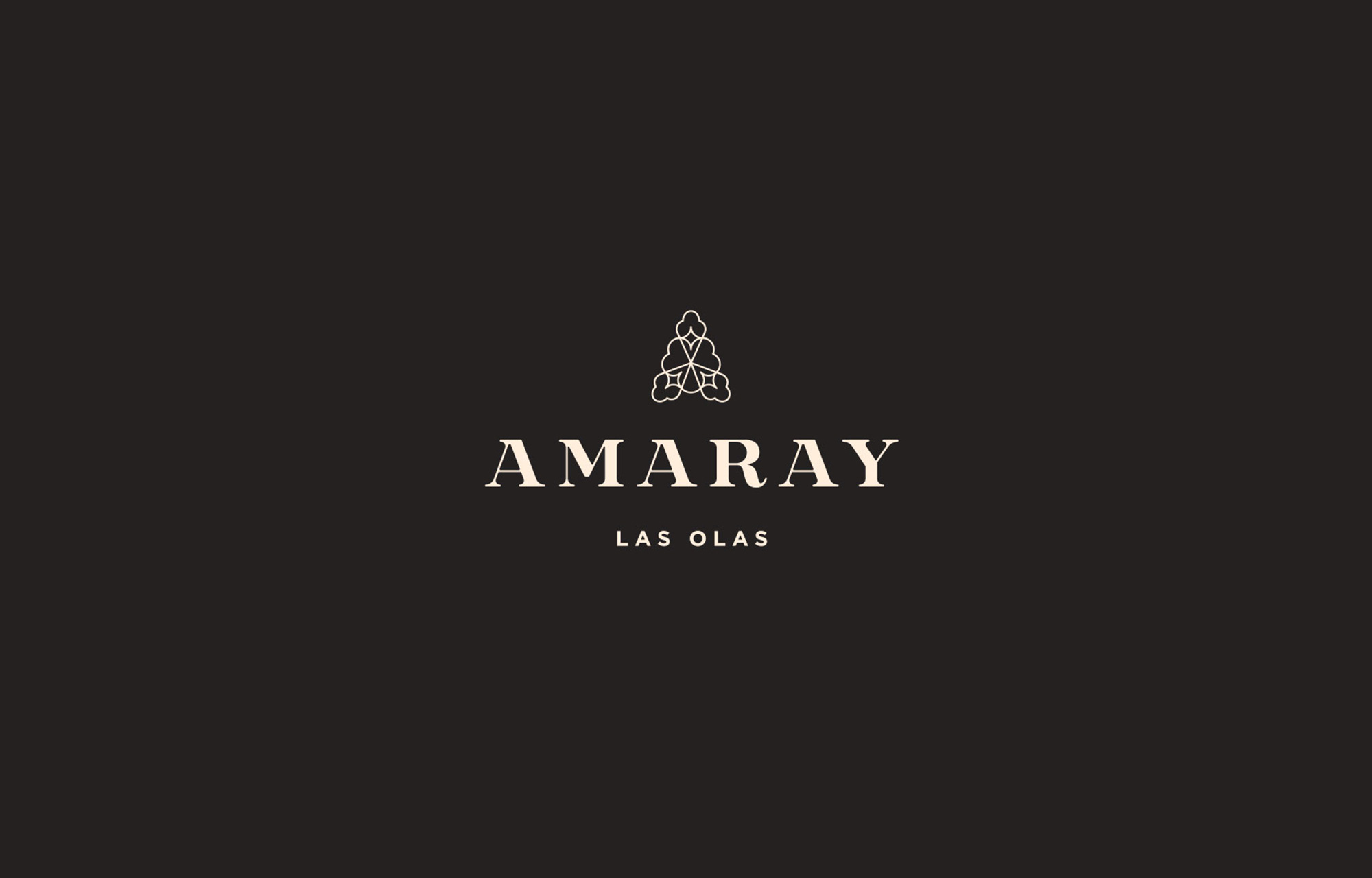

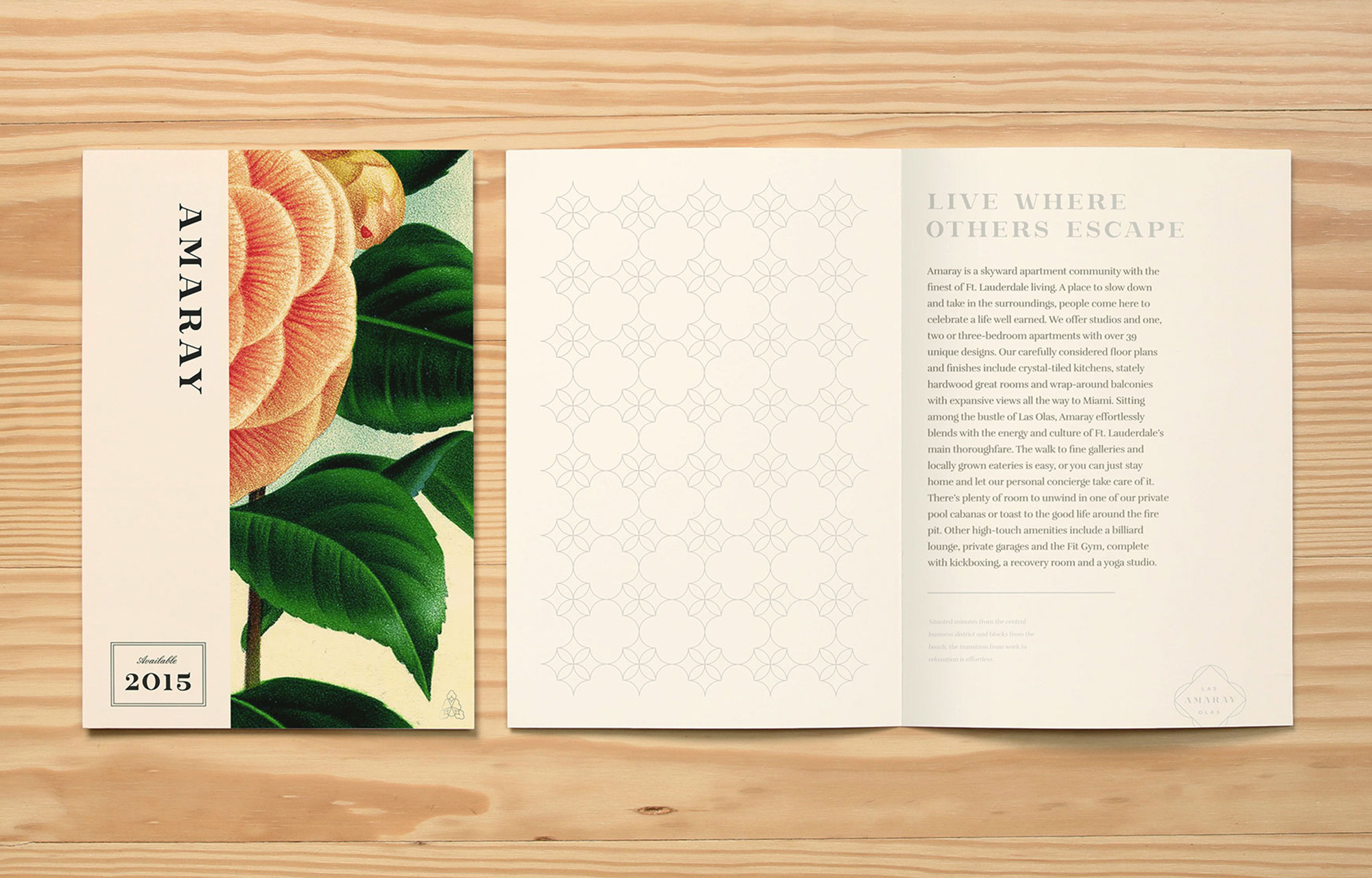
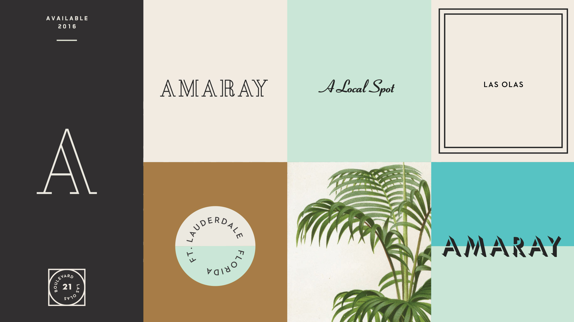
We found a moniker in local botanical history. The amaranth meaning “unfading flower,” combined with a sunny suffix, evokes the elegance and longevity so distinct in a trendy competitive landscape.
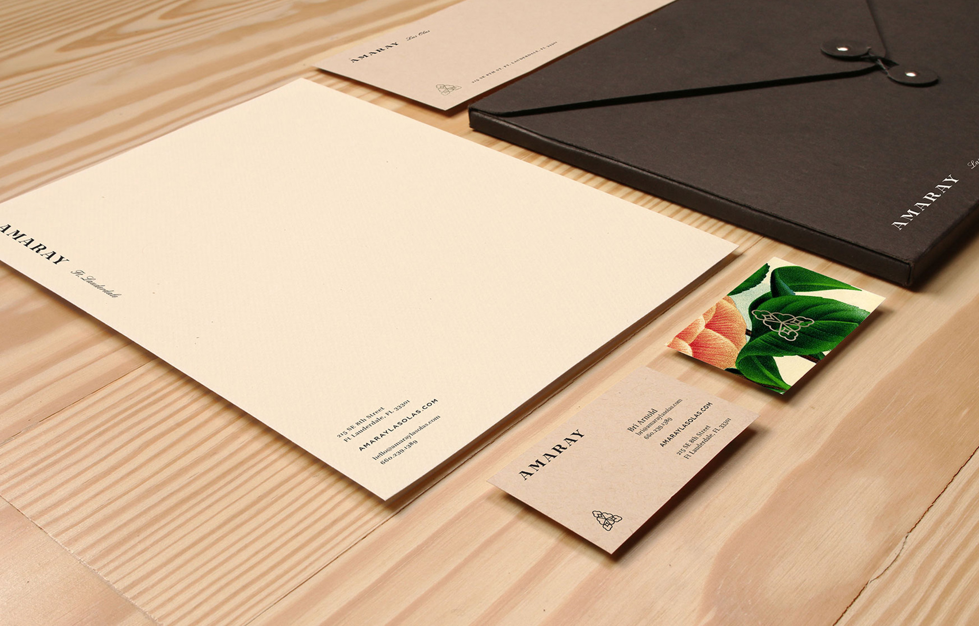
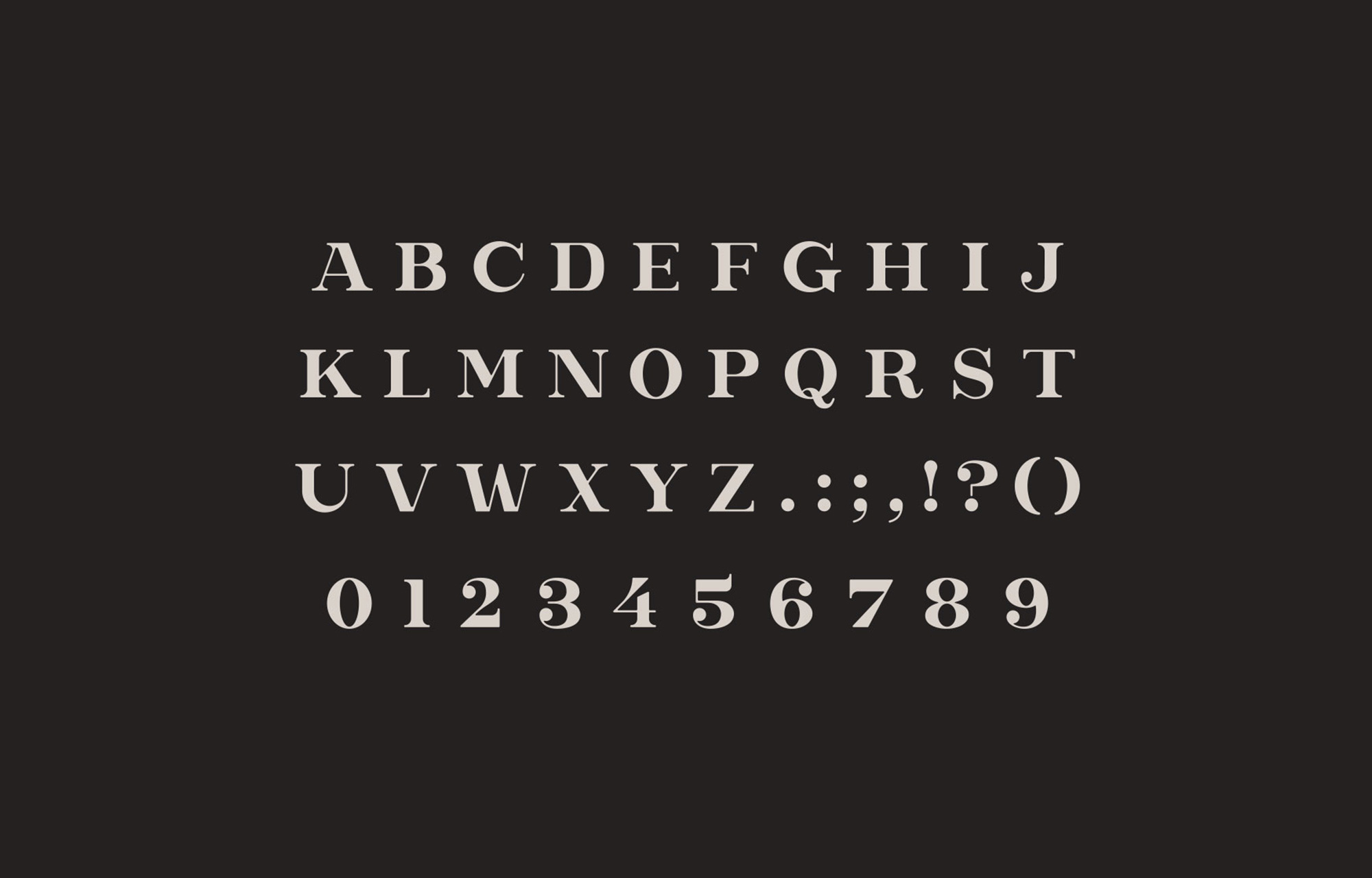
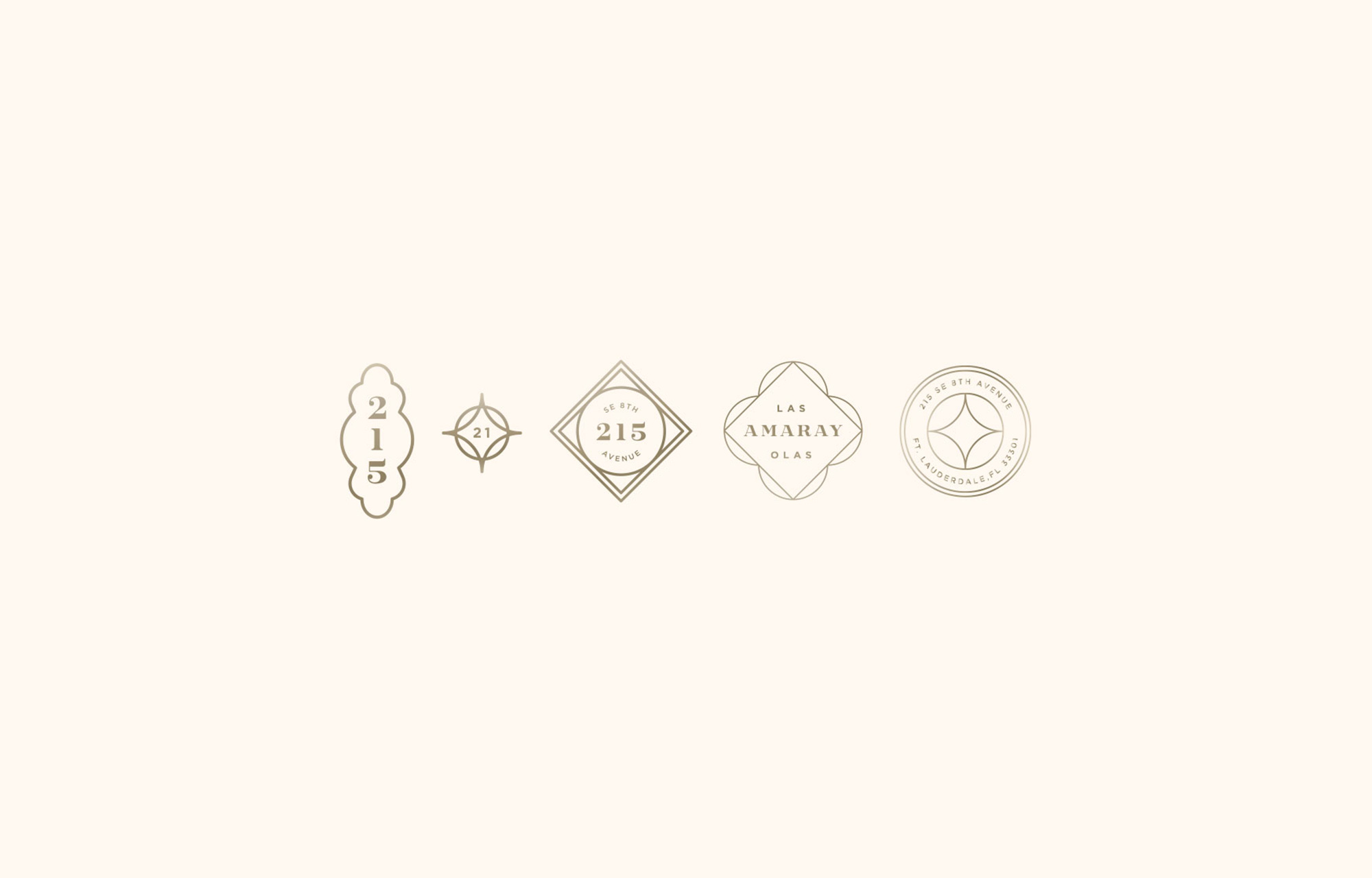
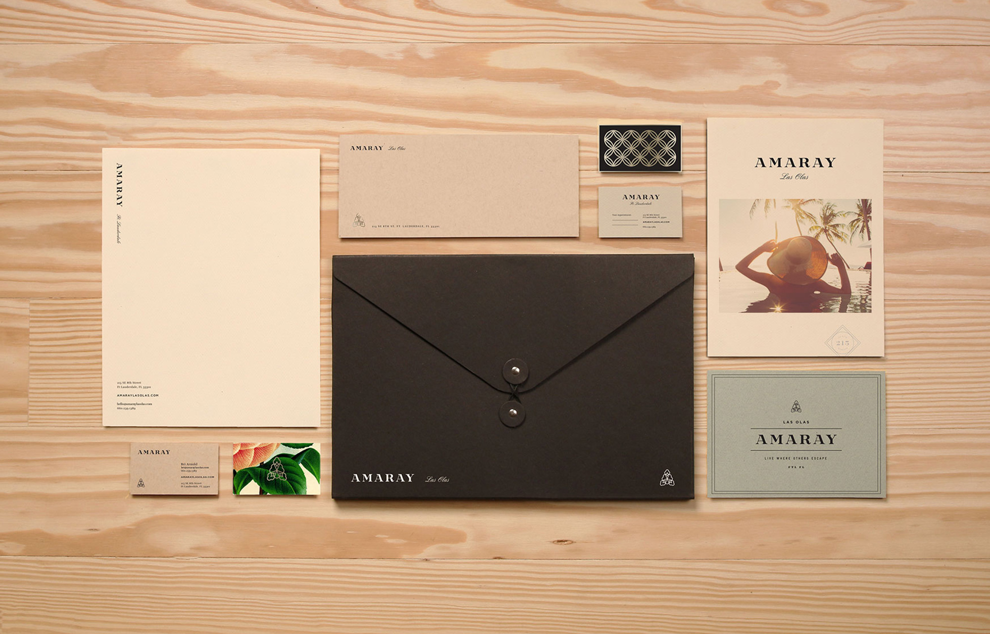
From the flower motif blossomed an abstracted “A.” The identity system flourishes with ornate patterns, champagne accents and nostalgic floral imagery. Starting with the characters in our custom wordmark, we built a complete, operational typeface to further position the brand at the top of the market.
From the flower motif blossomed an abstracted “A.” The identity system flourishes with ornate patterns, champagne accents and nostalgic floral imagery. Starting with the characters in our custom wordmark, we built a complete, operational typeface to further position the brand at the top of the market.
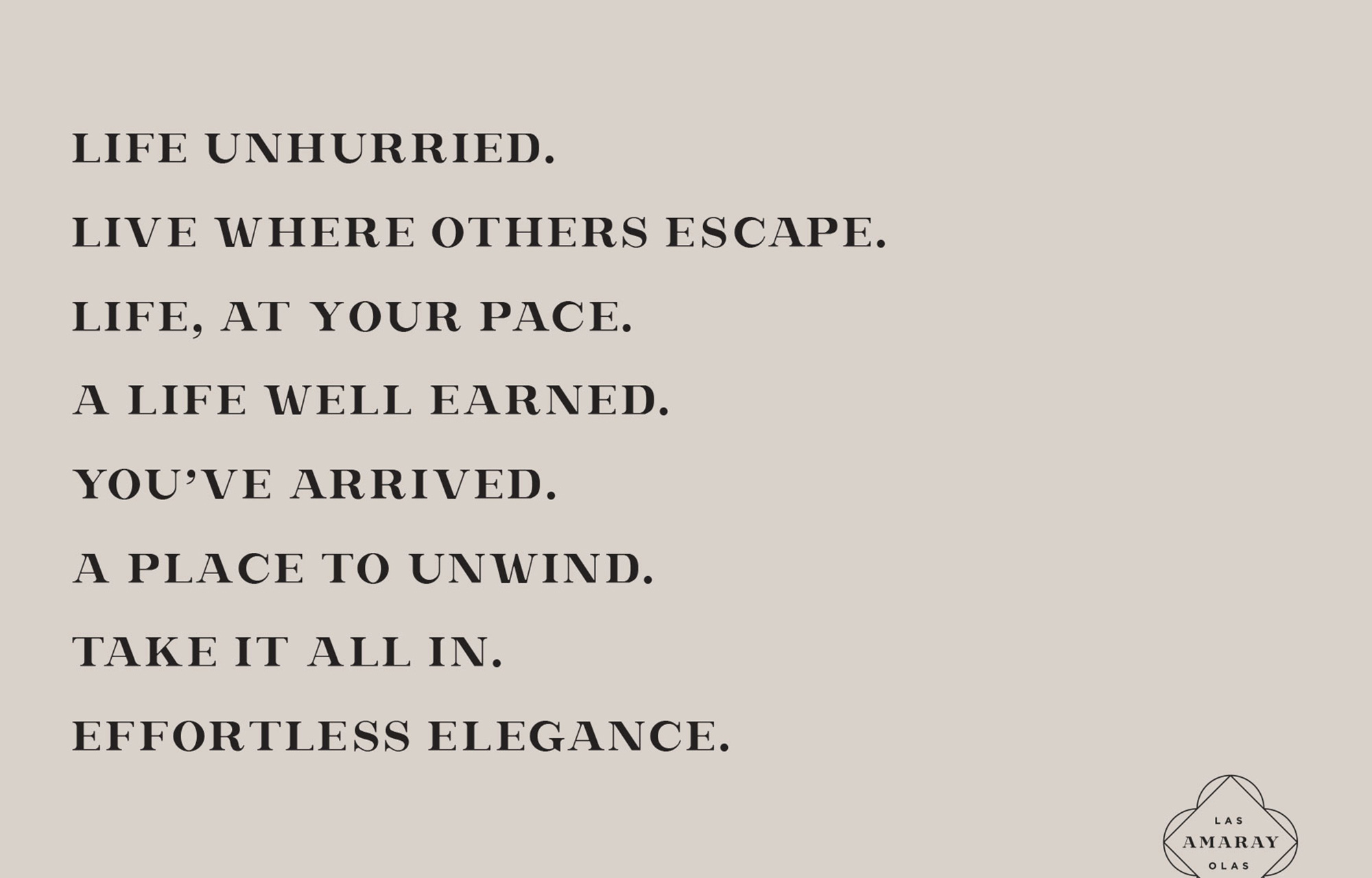
To fit the look, we rounded out the personality of the Amaray lifestyle with a unique voice and tone. Sophisticated, yet down-tempo, Amaray anticipates customer needs and communicates refined offerings with an effortless flow that sounds laidback and welcoming. All reveal our core concept—Time for Life.

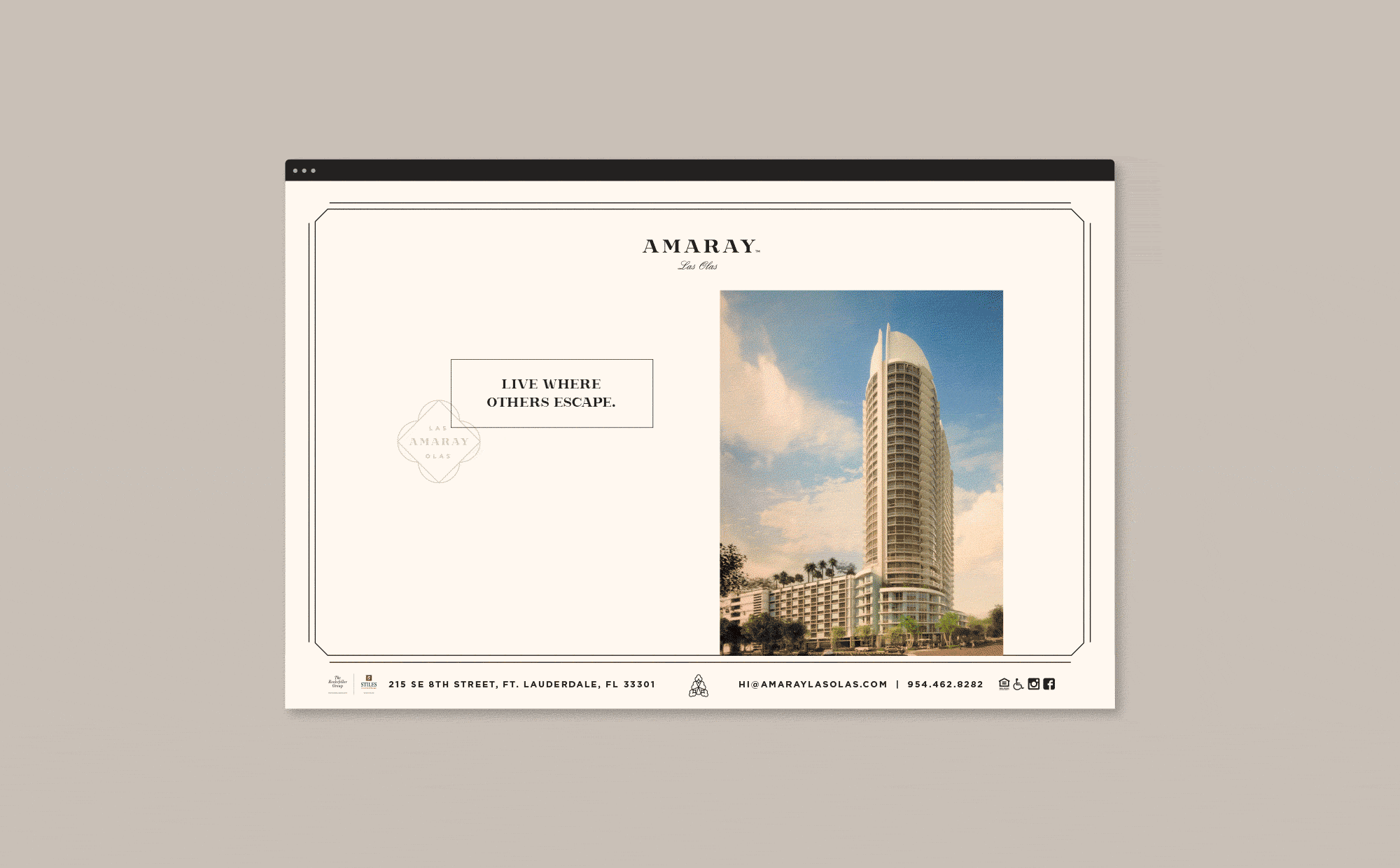
We designed the splash page like a postcard to a long-awaited destination. As a complete package, Amaray feels high-touch—appropriately thoughtful down to the foil-finished details.
Less than one year after we branded the building, the Rockefeller Group was able to sell for $133.55 million.
Less than one year after we branded the building, the Rockefeller Group was able to sell for $133.55 million.
Other Concept
__________________
Credits —
Brand Identity, Print, Web, Messaging © 2015
Roles: Identity Designer, Writer, Naming Support, Print & Web Design Lead
Identity Design Lead: Jonathan Lawrence
Name Lead: Jason Orme
Messaging: Danielle DePiper
Type Design: Brian Nelson
Studio: Matchstic
Brand Identity, Print, Web, Messaging © 2015
Roles: Identity Designer, Writer, Naming Support, Print & Web Design Lead
Identity Design Lead: Jonathan Lawrence
Name Lead: Jason Orme
Messaging: Danielle DePiper
Type Design: Brian Nelson
Studio: Matchstic