Project:
Keeping Forests—
Coalition/Campaign System Branding
*Honorable Mention, Graphis, 2021 Design Annual
*Featured on Brand New and their Best Icons of 2020
Keeping Forests—
Coalition/Campaign System Branding
*Honorable Mention, Graphis, 2021 Design Annual
*Featured on Brand New and their Best Icons of 2020
Role:
design lead &
art director—
brand identity, packaging
design lead &
art director—
brand identity, packaging
Keeping Forests is a regional coalition of landowners, conservationists, corporations and organizations work to ensure forests remain for generations to come. This diverse organization primarily needed a captivating identity that would build momentum around its effort to uphold Southern woodlands. Additionally, they they wanted to change the negative stigma associated with working forests.

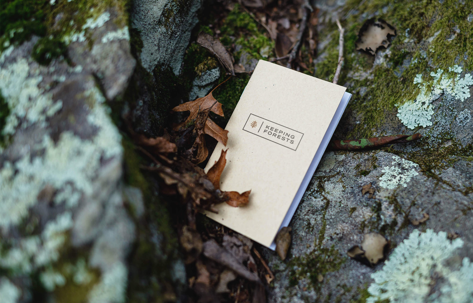
Logos in their landscape were visually similar—greens, trees, leaves—literal pictorial marks. We delivered a symbol with meaning to match the layers of the coalition and build affinity from multiple viewpoints. The symbol is at once a pinecone; a seed of growth for the spreading of ideas; a picture of regeneration. It is perhaps also a family tree (considering multi-generaional landowners), and it is reminescent of the hospitable pineapple. The logotype is selected for it’s visual link to parks and highway signage.
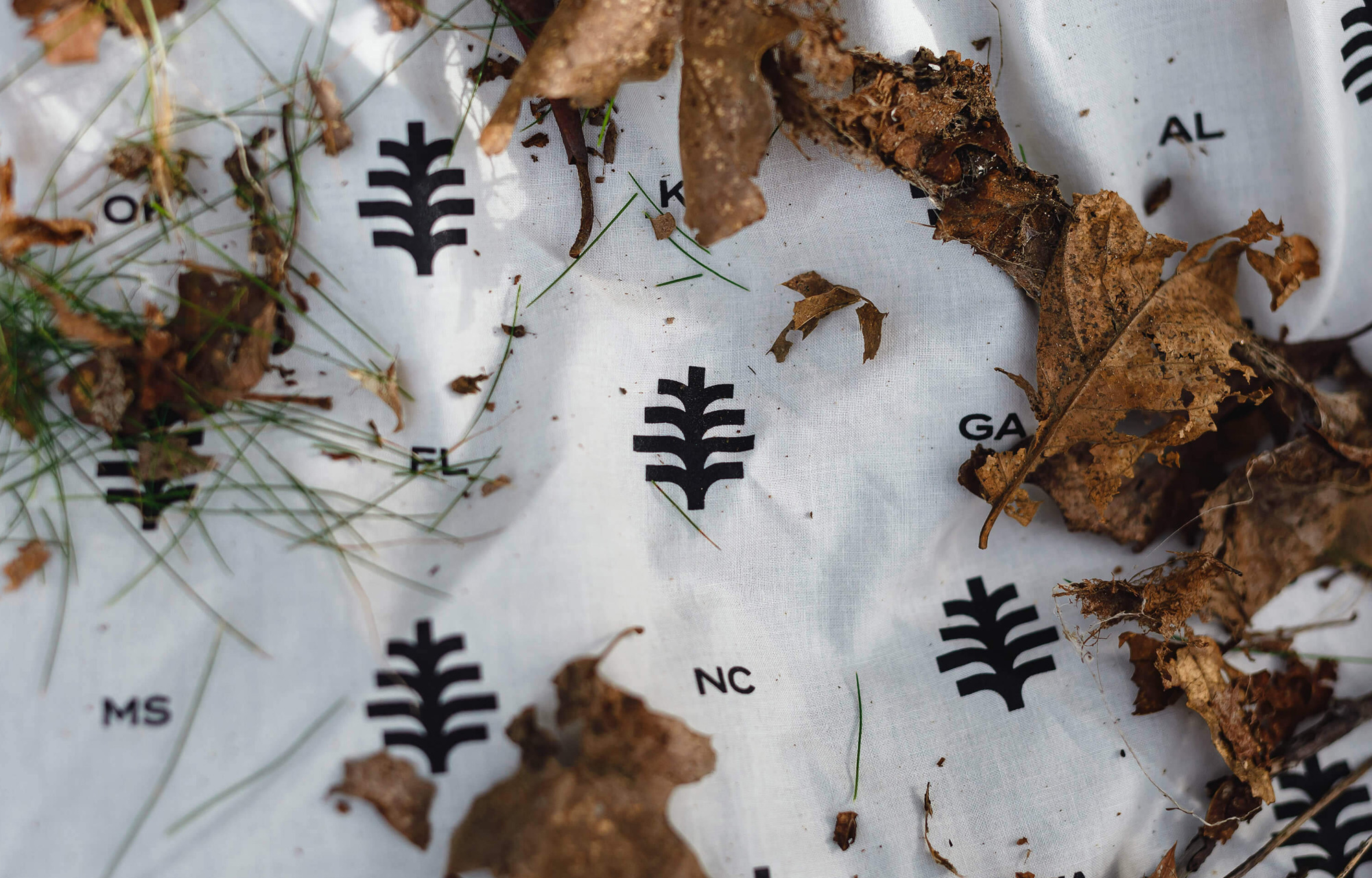

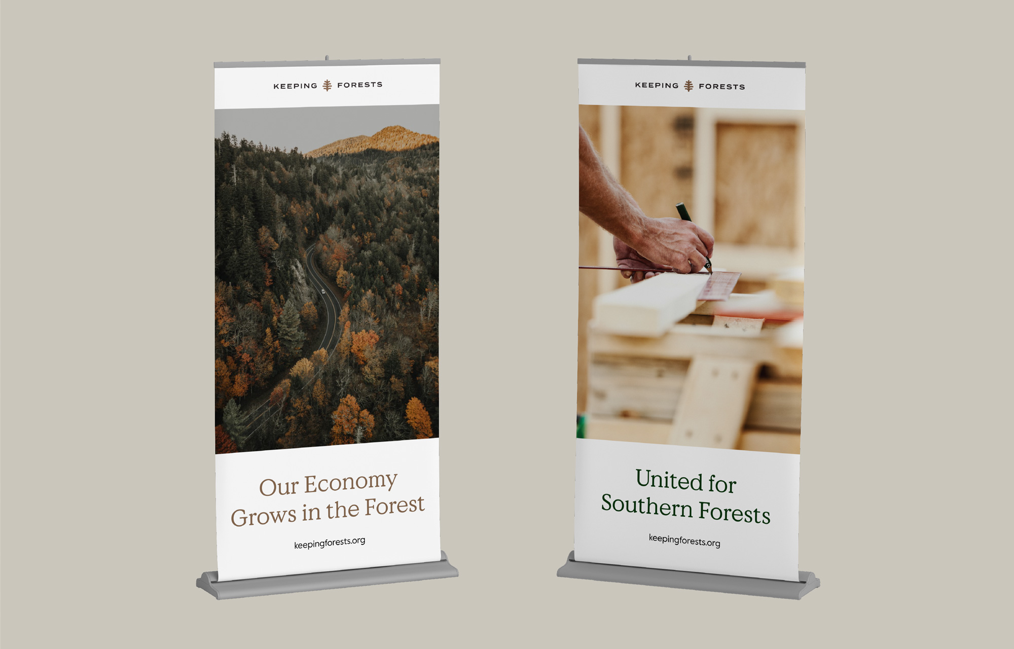
The most challenging requirement of creating this identity was considering maximum adoptibility and usability. The identity needed legs for the birth of grassroots efforts and campaigns. The elements need to be accessible and useful by a wide variety of contributors with varying resources and skillsets. Hence, a flexible set of brandmarks and lockups for future partnership, two sister typefaces, and an intentional system of imagery.
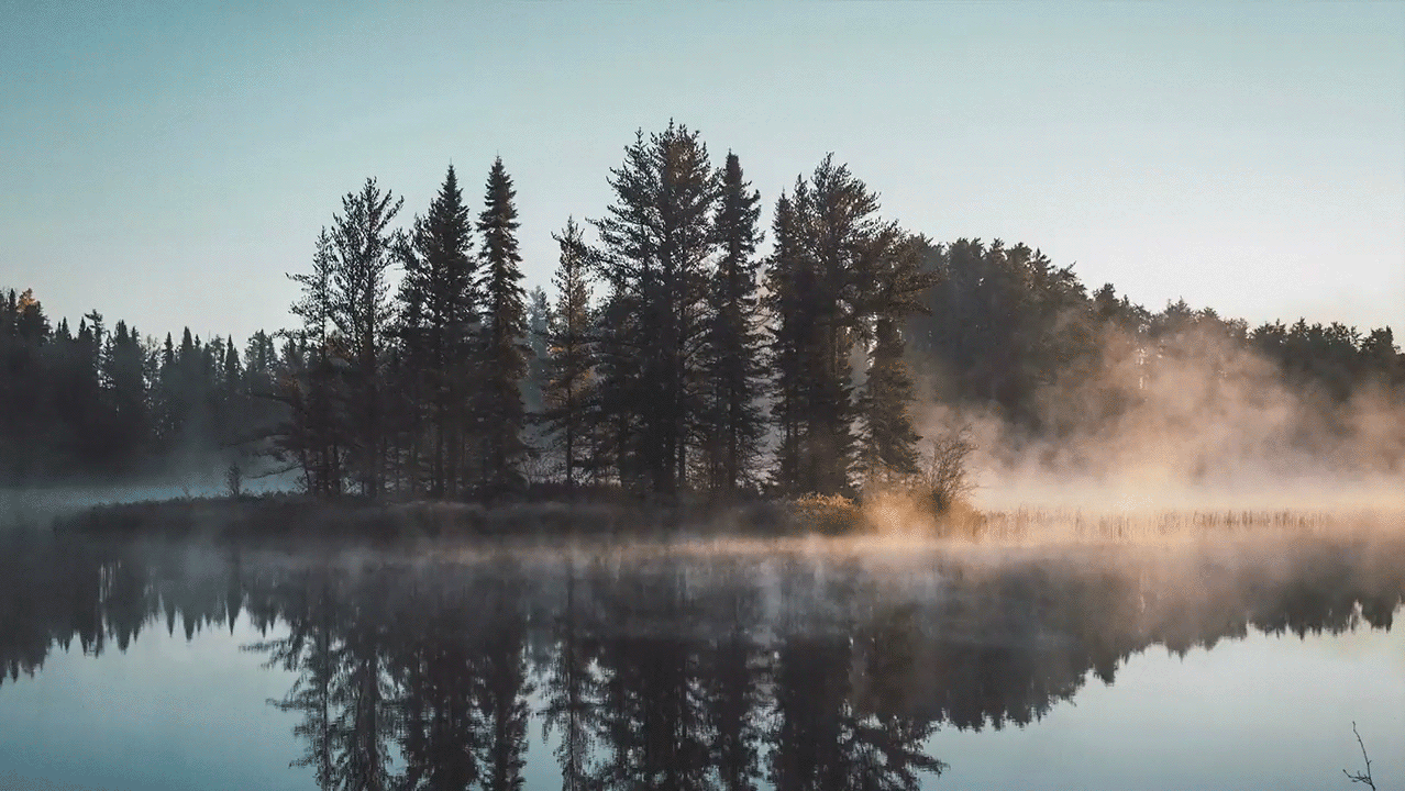
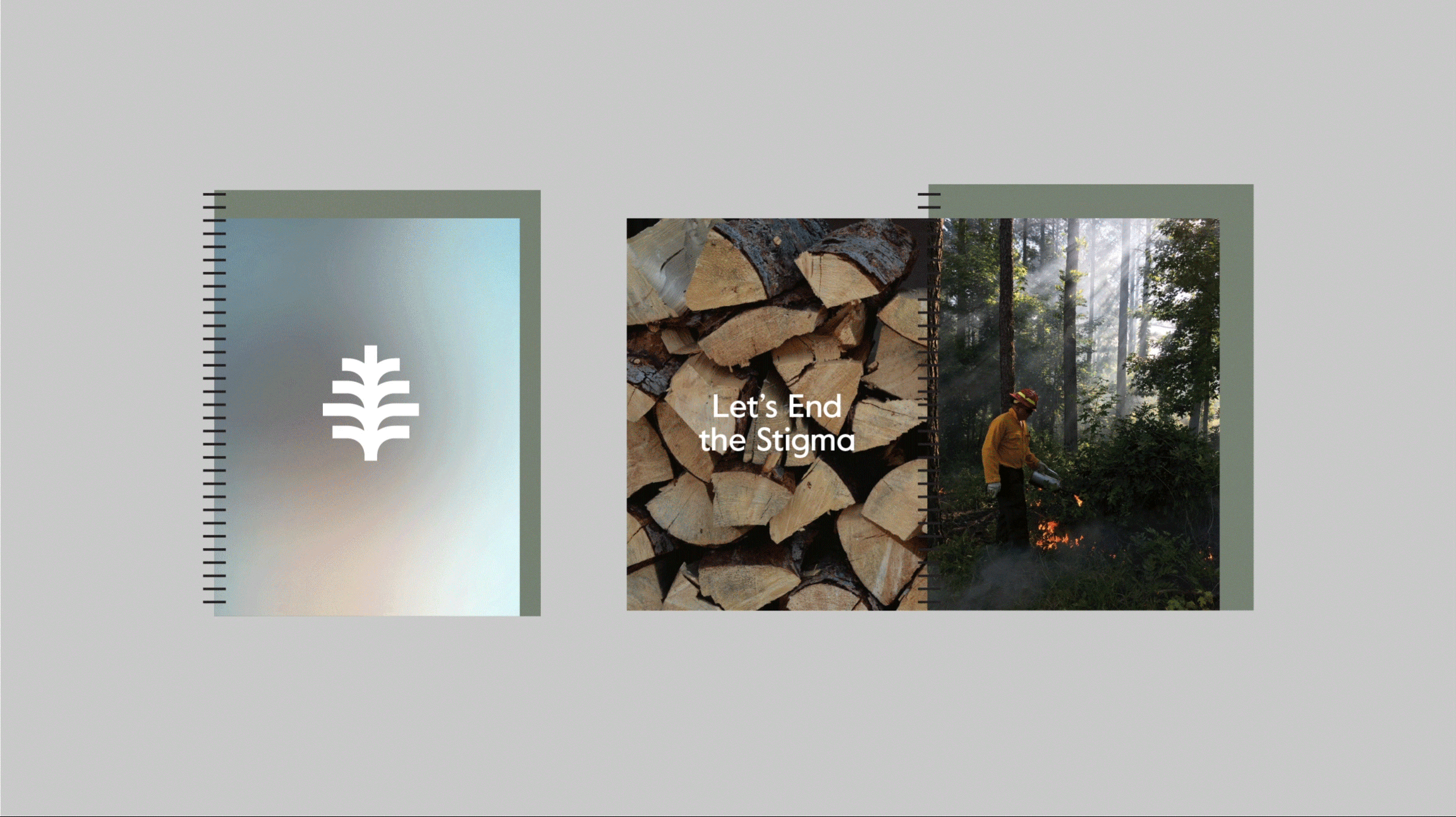
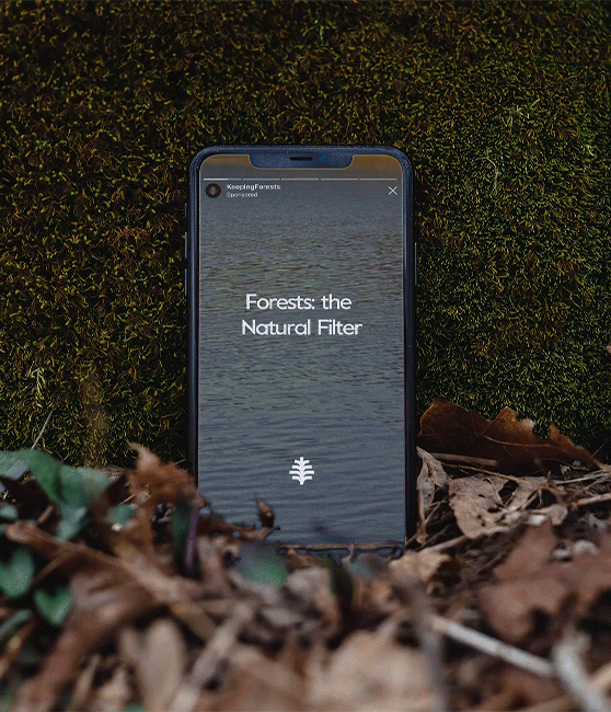
Early on, the idea of 100% natural color intrigued our team. We knew gathering sediment and natural dyes from the hues of raw material would be too time consuming an endeavor. However, we wanted to represet the natural, physical color identity of these Southern Forests. Two challenges dovetailed into a concise solution, when we were puzzlig over the difficulty of culling through the vast and varied photographic banks offered the project. Using extreme blurs allowed us to best represent the color textures of these forests and also provided a consistent thread through imagery that could be usable as color wash backgrounds for layering.
Early on, the idea of 100% natural color intrigued our team. We knew gathering sediment and natural dyes from the hues of raw material would be too time consuming an endeavor. However, we wanted to represet the natural, physical color identity of these Southern Forests. Two challenges dovetailed into a concise solution, when we were puzzlig over the difficulty of culling through the vast and varied photographic banks offered the project. Using extreme blurs allowed us to best represent the color textures of these forests and also provided a consistent thread through imagery that could be usable as color wash backgrounds for layering.
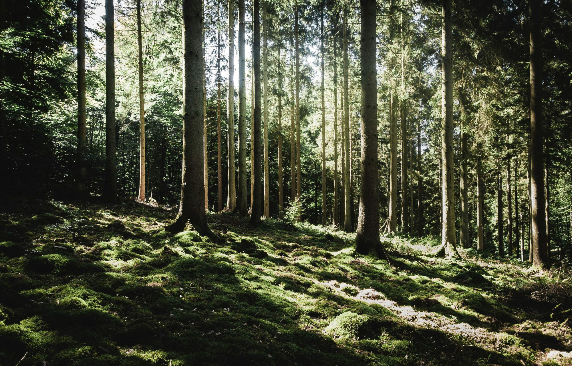
These blurs and three other categories of imagery (textural, environmental action, wide shots), are built to support the need for many different subjects. For example: manufacturing and production, end users with products of Southern Forests, working forests in use, forests as habitats, raw materials, recreation, and landowners.


Credits —
Brand Identity © 2020
Creative Direction: Danielle Wilson
Art Direction: Brit Blankenship
Design & Design Strategy: Terry Sieting, Brit Blankenship, Kieran McMaster, Miruna Talpas, Gray Hauser
Writer: Pamela Henman
Strategy: Sarah Gail Hughes, Danielle Wilson
Project Manager: Melissa Kruse
Studio: Matchstic
Client: Keeping Forests