Project:
Paul Mueller Company—Merger Rebrand
Paul Mueller Company—Merger Rebrand
Roles:
identity design support, strategy support
identity design support, strategy support
Paul Mueller Company has always been known for hard work, quality and expert craftsmanship. These traits allowed them to grow from a small, midwestern sheet metal shop to a global supplier of heating, cooling and storage solutions for farmers, brewers and engineers.
In the midst of this growth, they needed a brand identity that would elevate their heritage, while solving some of their growing pains—allowing them to move forward as a global industry leader.
In the midst of this growth, they needed a brand identity that would elevate their heritage, while solving some of their growing pains—allowing them to move forward as a global industry leader.
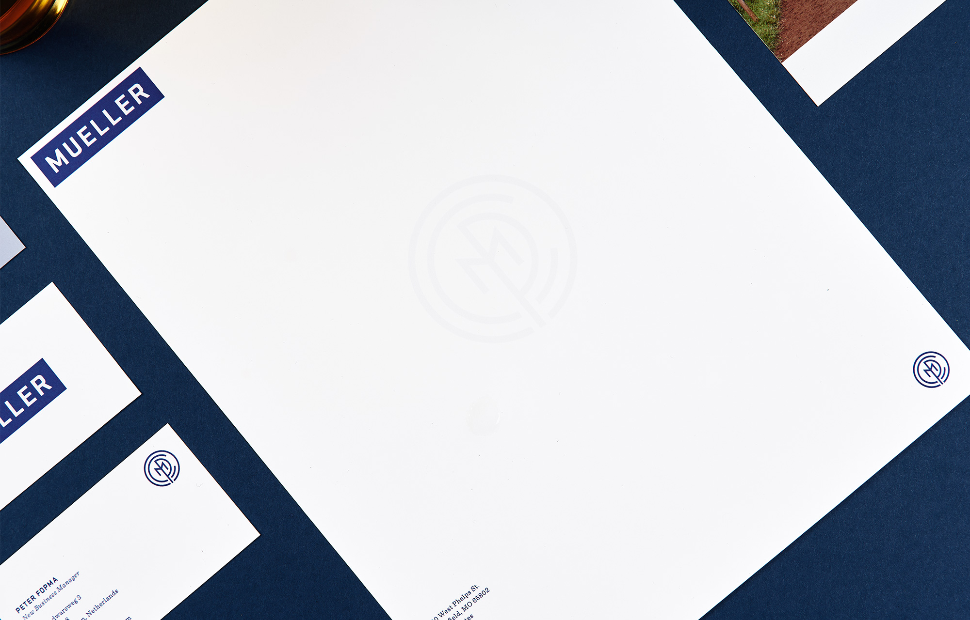

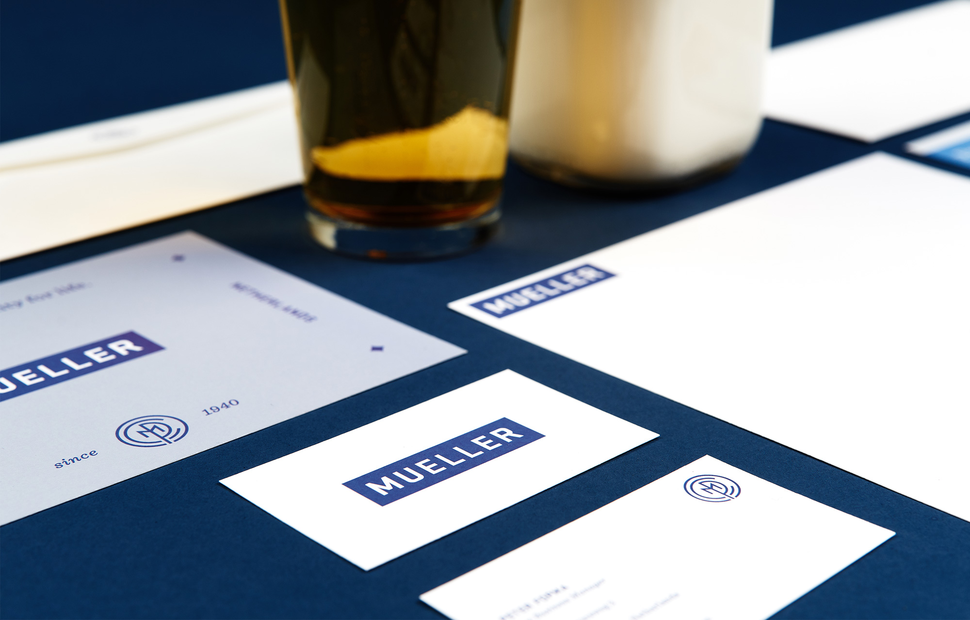
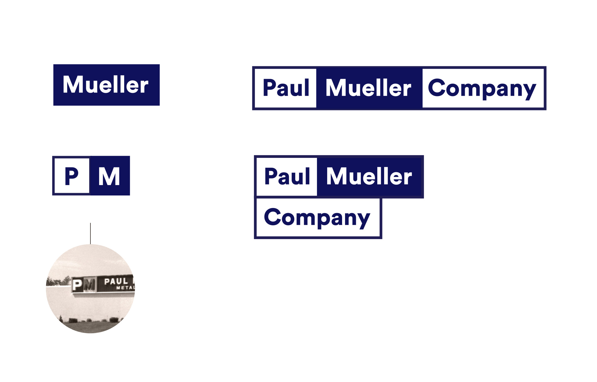
We evolved the Mueller mark to maintain equity in their blue rectangle and shortened the long, lanky shape to work better across digital and social media contexts. We then updated the wide, extended letterforms for greater legibility at small sizes.
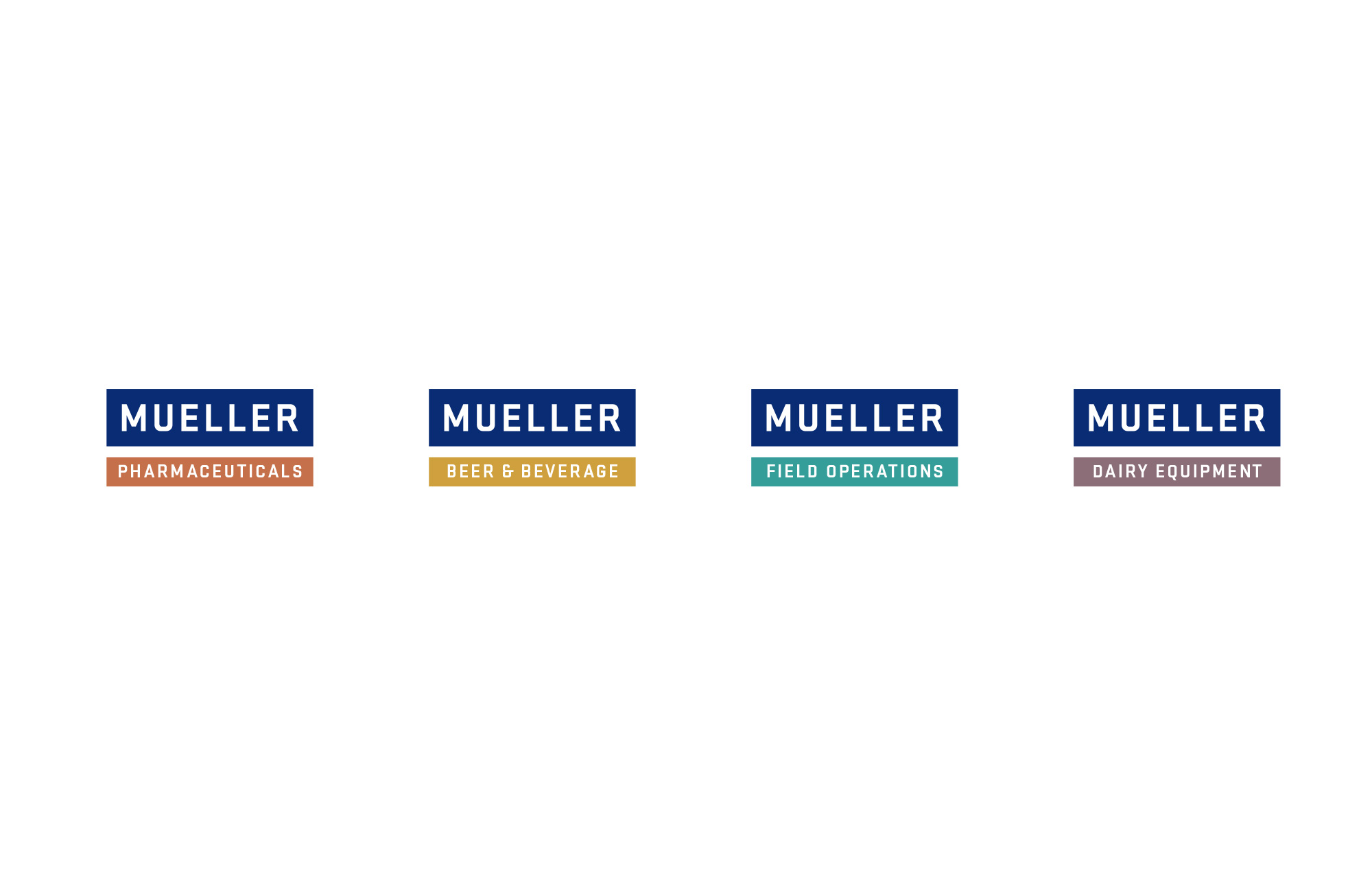
The visual identity system balances heritage with more modern sensibilities that point to their European division. The system consistently builds on the rectangle as a graphic device—translating to angular iconography, masculine typography, a modular web experience and sub-brand architecture that utilizes the shape.
The visual identity system balances heritage with more modern sensibilities that point to their European division. The system consistently builds on the rectangle as a graphic device—translating to angular iconography, masculine typography, a modular web experience and sub-brand architecture that utilizes the shape.


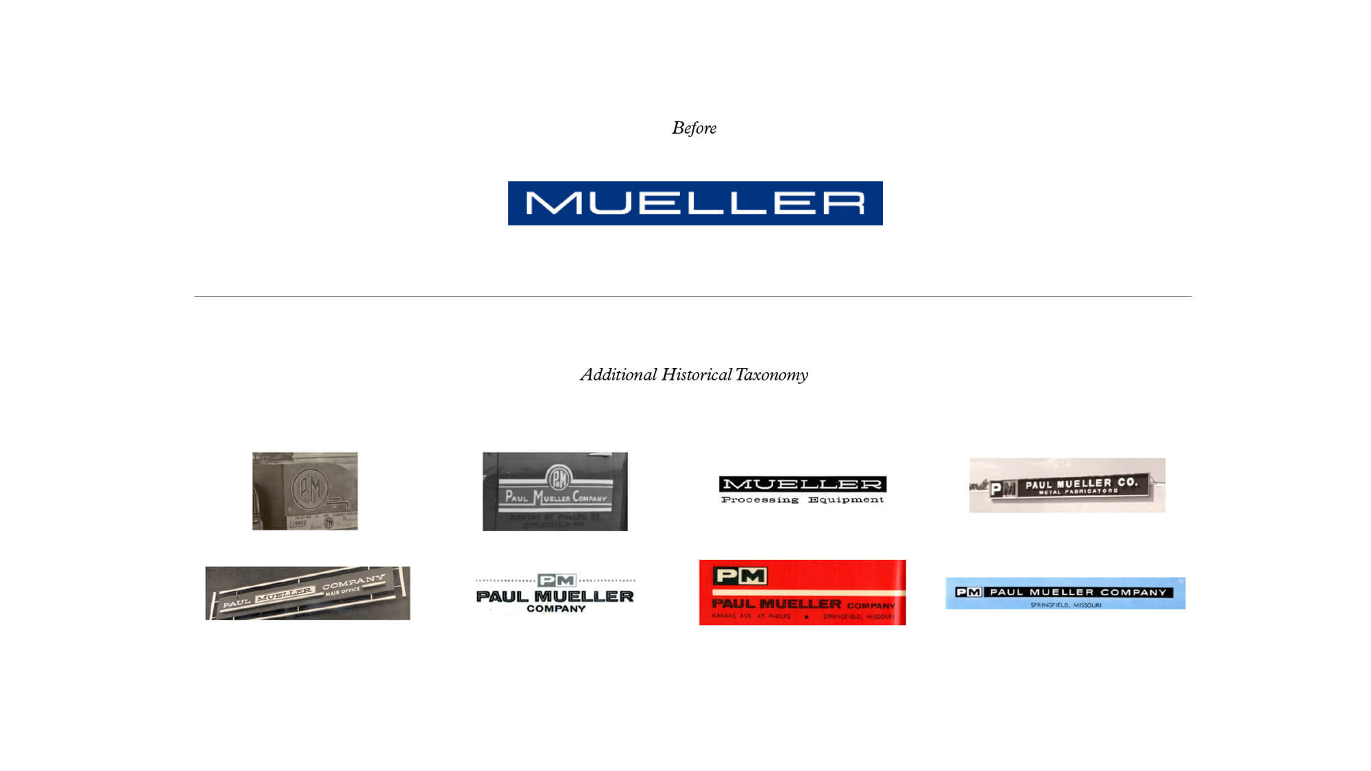
How do we proceed when half the world knows us as Paul Mueller Company and the other as Mueller, a name associated with many other North American and European brands?

Other Concepts (turn into 1 or 2 Gifs)
___________________


Credits —
Brand Identity, Strategy, Name Strategy © 2016
Roles: Designer, Strategist
Lead Designer: Jonathan Lawrence
Writer: Danielle DePiper
Strategists: Sarah Melnyk & Jonathan Bolden
Studio: Matchstic
Client: Mueller
Brand Identity, Strategy, Name Strategy © 2016
Roles: Designer, Strategist
Lead Designer: Jonathan Lawrence
Writer: Danielle DePiper
Strategists: Sarah Melnyk & Jonathan Bolden
Studio: Matchstic
Client: Mueller